
How to Choose Paint Colours: Light, Mood and RAL Shades
Choosing colour is the most exciting and the most stressful part of painting. These practical steps will help you decide with confidence and avoid costly repaints.
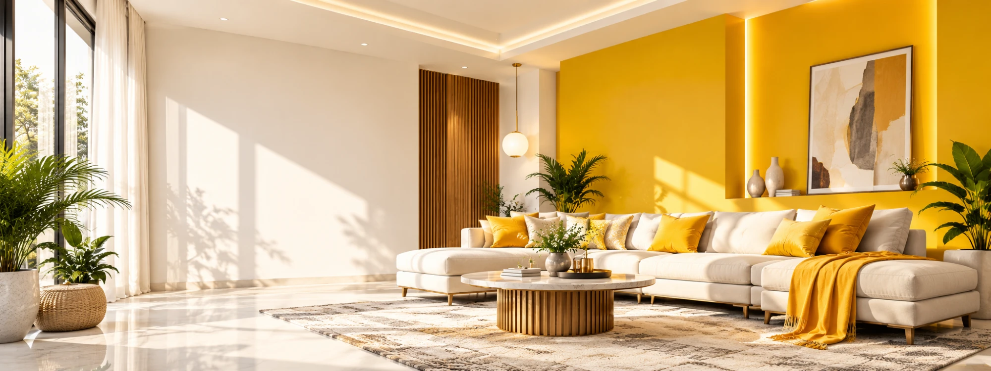
Colour sets the mood of a space more than any other design choice. The right shade can make a small room feel open, a large room feel cosy and a factory floor feel clean and safe. The wrong one can feel cold, dull or tiring within weeks.
Because colour looks different in every home, there is no single perfect shade. What you can do is follow a process that removes the guesswork. This guide covers light, mood, undertones, testing and how industrial users can specify exact RAL colours.
Start with how you want the room to feel
Before looking at shade cards, decide the mood:
- Calm and restful: soft blues, greens, warm greys and creamy whites.
- Warm and welcoming: beiges, soft yellows, terracotta and peach.
- Fresh and energetic: bright whites, citrus tones and light aqua.
- Elegant and bold: deep blues, rich greens, charcoal and plum, often as a feature wall.
Think about how the room is used. Bedrooms and study rooms benefit from restful tones, while dining areas and entrances can handle more energy.
Understand light and direction
A colour is not just what is in the tin. Daylight changes through the day, and each direction gives a different feel. North-facing rooms get cooler, softer light, so warm shades help balance them. South-facing rooms get bright, warm light, which suits almost any colour including cool ones. East-facing rooms are bright in the morning and softer later. West-facing rooms glow in the evening, which can make some colours look more intense.
Artificial light matters too. Warm bulbs add a yellow cast while cool white bulbs make colours look crisper and bluer.
Look for the undertone
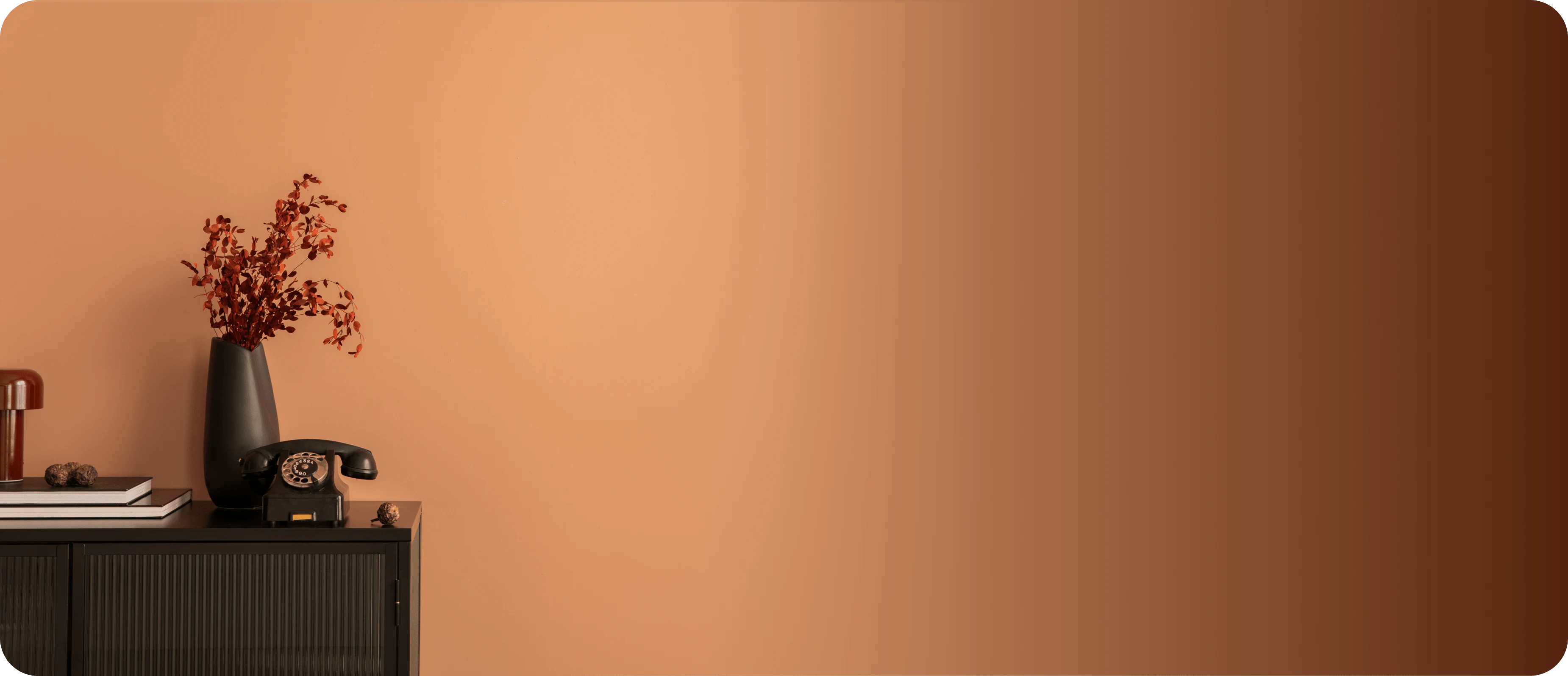
Most colours have a hidden undertone. A grey can lean blue, green or purple. A white can lean warm cream or cool blue. Undertones become obvious on a large wall and next to flooring, curtains and furniture.
Hold your shade card next to the things that will stay in the room, such as the floor, wood and fabrics. If the undertone fights with them, try another shade from the same family.
Test before you commit
Always test paint on the actual wall. Paint a sample patch at least one metre square, or paint a large board that you can move around the room. Check it in the morning, afternoon and evening, and view it from different parts of the room. Let it dry fully, because most paints dry slightly darker or lighter than they first appear.
Live with the sample for a few days before you decide. It costs very little compared with repainting a whole room.
Use the 60-30-10 idea
A simple way to balance colour is the 60-30-10 rule. Use a main colour for about 60 percent of the space, usually the walls. Add a secondary colour for about 30 percent, such as furniture and curtains. Use an accent for the final 10 percent, such as cushions, art and small decor. This keeps a room lively without feeling chaotic.
Feature walls follow the same idea: one bolder wall in a room of calm colours gives a focal point without overwhelming the space.
Colour for small and large rooms
Light colours reflect more light and make small rooms feel larger. Dark colours absorb light and make large rooms feel more intimate, though they need good lighting. Painting the ceiling a lighter shade than the walls makes the room feel taller. Using the same colour on walls and trims can make a narrow space look wider and cleaner.
Specifying exact shades with RAL colours
For industrial, commercial and architectural work, accuracy matters. RAL Classic is a standard colour system where every shade has a code, such as RAL 5015 for sky blue or RAL 9005 for jet black. Using a code means everyone on the project, from the designer to the applicator, refers to exactly the same colour.
On our RAL Colours page you can browse the shades, search by code or name and preview a colour on steel pipes and a pressure vessel. Use it as a guide, and always confirm the final shade with a physical sample before ordering large quantities, because screens show colour differently from real paint.
Final thoughts
Choose the mood first, check the light, find the undertone, test on the wall and give yourself time. If you are working on an industrial project, specify colours by RAL code to avoid mix-ups. Our colour team is happy to help you make the final call.